backuptruck
-
Posts
5 -
Joined
-
Last visited
Content Type
Profiles
Forums
Downloads
Store
Gallery
Bug Reports
Documentation
Landing
Everything posted by backuptruck
-
Calling All Graphic Artists: Help Design the Logo for unRAID!
backuptruck replied to jonp's topic in Announcements
Good point. On my second attempt, I did create a simple logo concept that can stand on its own as an icon for Lime Tech's product. I think it visually communicates everything about the product: - it takes the standard representation of a RAID array and 'turns it on its head' with the one platter rising up and smashing convention - the crack effect can either represent breaking away from the RAID paradigm, or a lightning bolt that supercharges the array - the platter also clearly refers to the the company as a slice of lime I can work on making a glossy, colourful render if they like my concept and would like me to develop it further. I like how it looks in the most simplified form though along with the name. It would just need some further refinement. And in case it isn't obvious, I made the 'un' in unRAID look like it's pushing away the word RAID. -
Calling All Graphic Artists: Help Design the Logo for unRAID!
backuptruck replied to jonp's topic in Announcements
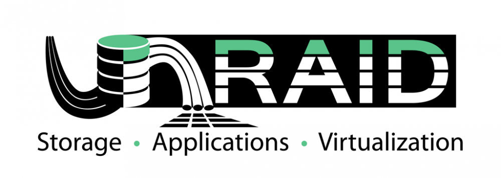
I thought of a bunch of slogans but liked this one the best. Underneath can be added specific examples like "NAS, Dockers, VMs, and more."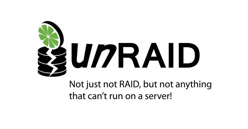
-
Calling All Graphic Artists: Help Design the Logo for unRAID!
backuptruck replied to jonp's topic in Announcements
Okay, here's another idea in a different direction emphasizing that unRAID is really not RAID! Again, just expressing a concept and not concerned with a beautiful colour logo.
-
Calling All Graphic Artists: Help Design the Logo for unRAID!
backuptruck replied to jonp's topic in Announcements
Thanks for the comment. I was trying to imply a departure from traditional RAID with with the dark/light, yin yang effect, and the coloured disk represents unRAID's parity volume.. This was basically a vector sketch and I didn't bother to render out a nice graphic. -
Calling All Graphic Artists: Help Design the Logo for unRAID!
backuptruck replied to jonp's topic in Announcements
Here's my rough concept that's a bit overcluttered to show the ideas but I think it could make the basis for a nice logo after some work in refining the elements. I accidentally uploaded a vertically scaled image of the logo. Here is the original, which is too wide, but it looks a little better in some ways.